It is no surprise that the FIFA World Cup 2026 logo managed to grab some global attention ever since it was revealed. In fact, it’s sparked some passionate talks within the football community and even for design lovers everywhere. The logo represents the first-ever tournament in the World Cup to be hosted by three countries: USA, Canada, and Mexico. In such, the logo shows the unity, modernity, and global celebration of the upcoming games. Reactions are rightfully mixed, but the emblem shows a new chapter in the history of the tournament. Here’s a deep dive in what the logo means.
Exploring the FIFA World Cup 2026 Logo
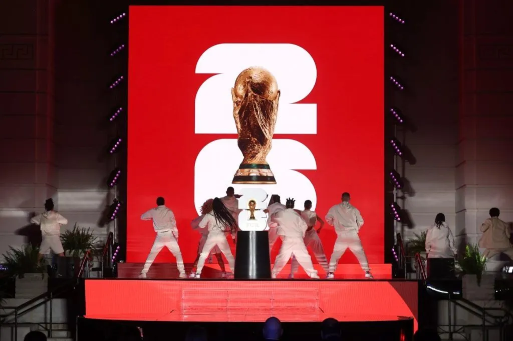
Starting back, the new FIFA World Cup 2026 logo was revealed at an event in Los Angeles – the best place for forward-thinking identity for the most prestigious tournament in football. In fact, the most notable feature is the combination of the World Cup trophy with the bold number “26”.
The Design Concept
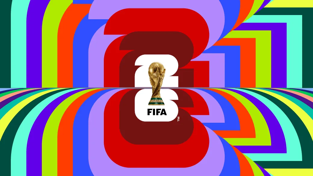
When one looks at it at first, the design is minimalist, but overall, impactful. The World Cup trophy is front and center on top of the number “26”, which signals the prestige and global achievement of this tournament. Beneath the trophy, one can see the FIFA name that reinforces the authority and authenticity of the games. Compared to older logos that included the host country’s motifs or shapes, this version is clean and simple. Many would say, a deliberate move for modern digital adaptability.
Symbolism and Significance

Each element found in the World Cup 2026 logo, well, it carries meaning. The number 26 is a combination of squares and quarter circles, which should represent a pitch’s structure and the game’s ball geometry. FIFA also expounded that there are 48 geometric units, which then symbolizes the 48 nations that will be competing in the expanded new FIFA World Cup 2026 format.
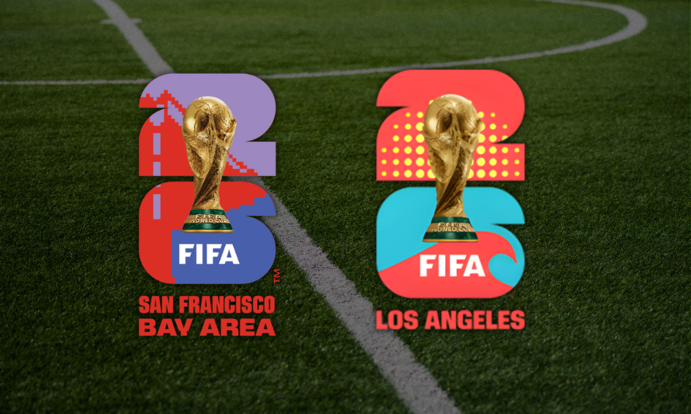
The emphasis on structure and inclusivity is equivalent to FIFA’s goal in expanding the reach of football. Its minimalistic aesthetic also allows host cities to add their own identity for their localized versions. Such versions include the Golden Gate Bridge on San Francisco’s design and the wave patterns in Los Angeles.
Mixed Reactions to the FIFA World Cup 2026 Logo
Such that comes with any modern rebrand, the FIFA World Cup 2026 logo comes with both praise and harsh criticism.
Critics’ Perspective
Many design critics have argued that the logo’s simplicity borders on laziness and lack of inspiration. As opposed to the past logos, such as the 2014 Brazil’s inspired vivid colors or Russia 2018’s ornate details, this 2026 version feels stripped down for many. It lacks the powerful storytelling one would find in global tournaments, feeling more corporate than celebratory.
SEE ALSO: Sustainability & Legacy: What 2026 Will Leave Behind
Defenders of Simplicity
Although, many believe that simplicity = strength. The minimalist style, to fans, actually shows versatility for both digital and physical mediums. It shows the modern branding trends of this day and age where bold typography and clean layouts speaks larger than big colors. The logo for the FIFA World Cup 2026 shows itself to be timeless piece, which is easy to recognize, and is globally adaptable. All of which are essential qualities for a tournament that’s being held in three nations.
A Celebration of Unity: WE ARE 26 Campaign

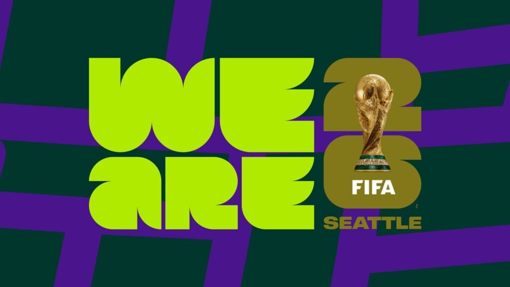
FIFA also launched the WE ARE 26 campaign together with the logo reveal, which symbolized unity and inclusion. This campaign also shows portraits and visuals that represented the diversity of the host cities and the people that embodied the cities’ culture.
The president of FIFA, Gianni Infantino, has described the campaign to be a “rallying cry” – which united three countries and a whole continued to welcome the world. He also mentioned that the FIFA World Cup 2026 logo and overall branding represents a celebration of human connection through sport as well.
Such a campaign, then, reaffirms that the goal of FIFA to make the 2026 World Cup to be the “biggest, best, and most inclusive” in history shall be a milestone moment.
The Historical and Cultural Context
The 2026 FIFA World Cup will be a first of its kind. It will feature 48 teams in 16 cities with an unprecedented 104 matches. The event has never been held in three host countries at the same time as in the present case of the United States, Canada and Mexico.
Design-wise, this expansiveness needed a brand name that had the capacity to harmonize different cultures but at the same time, should be easily identified. This balance is achieved by using neutral colors (black, white, and gold) as a foundation of the FIFA World Cup 2026 logo, which are personalized by each specific city.
Font and Color Design of the FIFA World Cup 2026 Logo
Typography is an important element in defining the modernity of the logo. The name FIFA is typed using a geometric sans-serif font, such as Nula Heavy or Burlingame Pro Condensed Black. Such sharp diagonal cuts provide the lettering with an assertive futuristic impression.
Concerning colors, FIFA came up with two primary palettes:
- A black-and-white copy with a gold trophy to be presented officially.
- A multicolor edition that highlights the diversity of the globe, the energy of the fans of the game all over the world.
This two-sided strategy provides the FIFA logo with adaptability to be used in corporate and festive contexts, either via official ceremonies or city branding.
SEE ALSO: How to Watch World Cup 2026: TV & Streaming
Legacy and Evolution of the FIFA World Cup Logos
FIFA world cup logos have reflected the zeitgeist over the decades. The playful smiley faces of From Germany 2006 to the cultural flair of the South Africa 2010 design each tells a story about the host country. The FIFA World Cup 2026 emblem represents a new twist: A single global symbol with an emphasis on simplicity, scalability and universality rather than on localism.
The fact that the World Cup trophy was promoted instead of the abstract symbolism also points to a change in the branding philosophy. The goal of FIFA is to establish a familiar brand framework that will be used in years to come. Plus, to base all the subsequent logos on the iconic trophy and the year in which the tournament is held, like the FIFA World Cup 2026 logo shows.
Reactions from the Football Community

In the Los Angeles launch, football super stars such as Ronaldo Nazario, Carli Lloyd and Youri Djorkaeff were present. Concacaf president Victor Montagliani and MLS commissioner Don Garber hailed the collaborative design as the FIFA World Cup 2026 logo embodies the ethos of teamwork throughout North America.
Although not all fans agree on the artistic quality of it, the very message behind the branding of inclusiveness is a very powerful one. The variant of each host city will be an enrichment of the cultural layer of the logo, so two versions of the logo will not look absolutely similar to each other, but the tournament, in turn, is diverse.
The Road to the 2026 World Cup
The 2026 World Cup is set to transform the magnitude of global football. The growth of FIFA to 48 teams and its association with three countries is a sign of a new globalized era. The FIFA World Cup 2026 logo with its contemporary minimalism and symbolic geometry has been used as the pictorial point of reference to this journey of first kind.
Organizations are already planning, and match schedules are being planned, and the host city branding is being executed at a gradual pace. With the anticipation, the logo will take over stadiums, broadcasts and other merchandise globally as fans embrace the logo as the face of the future of football.
Conclusion: The Legacy of the FIFA World Cup 2026 Logo
The FIFA World Cup 2026 logo is not just a piece of art. In the end, it is a declaration of purpose. It is a redefined international identity of the football ultimate event. Its artistic simplicity may be argued about, but its strong points are flexibility, symbolism, and vision.
This logo will serve as a symbol of togetherness in the world, among nations, players and fans as the world looks into 2026. It reflects not just the spirit of the rivalry but also the universal human interest which makes football really the same.
With this logo being a bridge between the old and the new – it’s an insignia that is set to usher football into its next defining moment.


